by Jim Smith
You’ll remember that in the second blog of this series (Overall Agreement), I wrote that it is a mistake to assume that all readers are familiar with the “contingency table,” sometimes called the error matrix, or the confusion matrix. “I assume” is among the most dangerous phrases in the English language, but it you feel comfortable with the contingency table, skim or skip this blog and look forward to the last in the series of blogs, coming up next.
As you are reading, remember the first group of five assumptions that I presented in that blog. They are fundamental to an agreement analysis.
The contingency table is certainly not a new idea. It has a long history in the statistical world, but is really no more than a cross-tabulation of what the reference data indicated at a specific location versus what the map indicated at that same location. While there are few hard and fast rules for developing a contingency table, there are some conventions. A contingency table is normally square; it has the same number of rows and columns. However, the latter is not always required because a category can exist in the reference data that does not exist in the map, and vice versa. That said, if not taken into account, a non-square contingency table situation certainly muddles the overall agreement metric, so the user is cautioned. Map categories are typically the rows of a contingency table, and the reference categories are the columns. It is useful to keep more “similar” types closer together as the table is constructed if possible.
To be absolutely clear, let me throw some numbers at you. Here is a contrived, simple contingency table example with four categories that I will use for the remainder of the blog series.
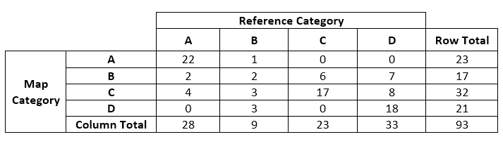
Note that the contingency table is square, with four relevant rows and four relevant columns. The row and column categories are in the same order (A, B, C, D); therefore, diagonal cells represent “agreements,” and off-diagonal cells represent “specific disagreements.” You may also assume that for this example I ordered the categories in terms of similarity where possible, i.e., “A” is most like “B” and least like “D.”
On 22 sample points, both the map and reference data indicated the category was “A” (agreement). On four sample points the map indicated the category was “C” but the reference data indicated it was an “A” (a specific disagreement). There were a total of 32 sample points mapped as “C” (row total), and 23 sample points classified as “C” (column total) in the reference data set. And so on….
In this case, you can sum up the diagonals (22+2+17+18=59) and divide by the total number of sample points (93) to compute a percent overall reference data/map agreement of 63%. But don’t stop there or you miss most of the story. The off-diagonal elements contain the real information in most situations, and they are where a potential map user needs to focus.
In the fourth installment of this blog series, I explore the usability of a data set/map.
Contact Jim